
Photo by Lukas Blazek
Last week we released a new v3.6.5 beta build 507. Today there are more than 70 new features, enhancements and fixes in v3.6.5 beta of WebRotate 360 Product Viewer (see version history). And while we have plans for a few more before the final release, now is a good time to cover the most interesting ones that are already available in the latest downloads.
1. Built-in web server
Starting with the latest build 507 of v3.6.5, we have packaged a tiny web server with SpotEditor to finally stop requiring any extra browser configuration for your local tests. Now every time you publish in SpotEditor, your local browser previews are loaded via the web server that runs inside SpotEditor which doesn't trigger any security flags with modern web browser. You will also notice that the preview URLs will look like this:
http://localhost:63533/xyz (or some other local port number)Though if you manually open published html files from your hard-drive, the extra steps discussed in this article are still required.
2. Videos, third-party content & scrollable content in hotspots

Historically it's been a challenge adding videos or "iframed" content in hotspot popups without some custom work. In the latest v3.6.5 we introduced advanced support for embedding videos, third-party content (e.g web pages, 3D panoramas, iFrames, etc) as well as using long scroll-able content inside the hotspot popups. Moreover in this hotspot mode, the popups are fully responsive and give you a lot of control over sizing either within the 360 product view itself or even outside of the view, i.e. centered on its parent page.
To activate this mode, first make sure to select the "lightbox" option under Render as on the first tab of the Hotspot form (third option). Then use button #2 in the screenshot on the Text Content tab to insert the URL of your custom content:
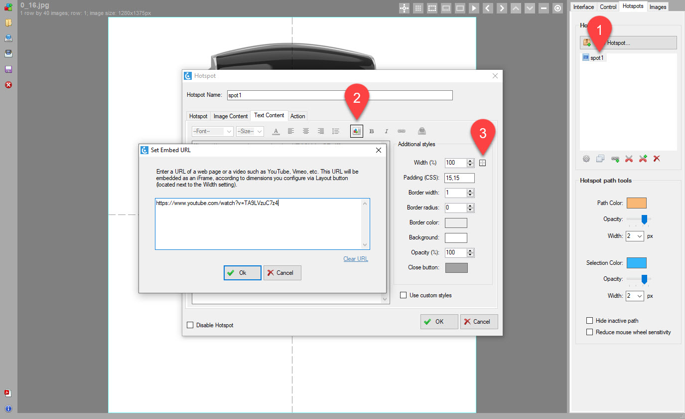
To see extended sizing and positioning options, click button #3 next to Width (%).
You may find that the close button that is automatically added in the top right corner of the popup overlaps the popup content. If so, simply add extra padding using Padding CSS option on the same tab. For example, if you enter 40,50 in the padding field, it will use 40px for top-bottom padding and 50px for left-right. Or use four comma separated numbers for top, right, bottom, left. Use Close button color picker to match your content color as required.
3. Configurable max zoom
This has been something we have resisted for a while. Zooming your high-res images over or below 100% of their published resolution never seemed like a good idea. Going over 100% makes images blurred and may slow down your browser (depending on how big you blow them up) while not zooming to 100% would seem like a waste of bandwidth.
But there're still good reasons to allow custom zoom scale and this is what this feature is about. Now you can set Max Zoom as percentage of your published image size and it can go both ways. For example, you may set it to 70% to ensure that when you zoom the view on a high-density retina screen (say an iPad with 2x2 pixels per dot), your zoom details remains sharp. Or you can set it to 200% to blow up the images and fill the screen to create a better presentation and reveal more information to the end-user.
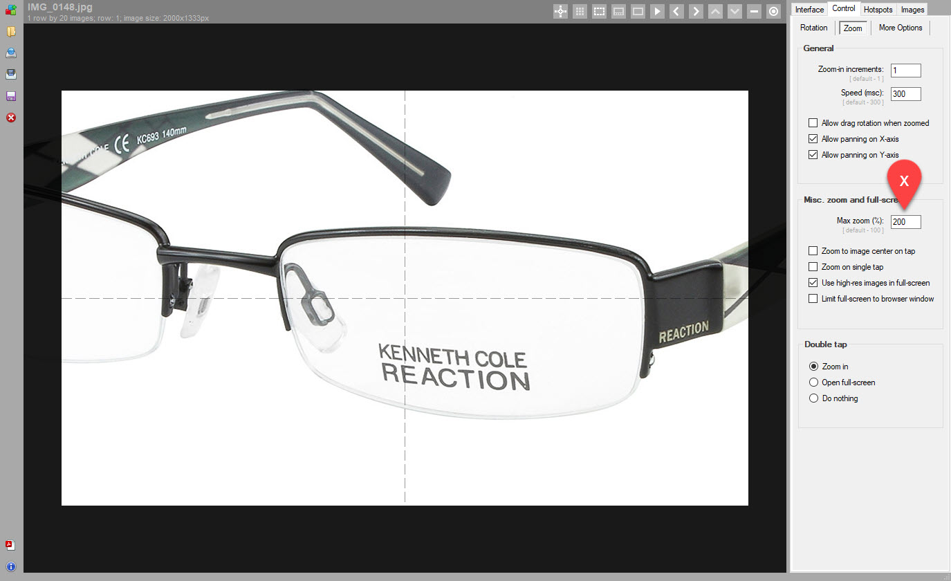
Also note the new "Zoom to image center on tap" that works great for narrow objects and ensures that no matter where user taps on the screen, we always zoom in to image center. This make it more user-friendly when zooming 360 product spins with tall narrow objects, especially in conjunction with the recently introduced "Pane and Spin" feature in v3.6.4.
4. Spin on page scroll
Sometimes you may want to give user a hint that the image they see is not simply a still image but an interactive 360 product view. And there're existing ways to do this, including setting automatic playback or placing a "Hint" message on top of the view that you can do under Controls tab in SpotEditor. One overlooked option is to spin images automatically as user scrolls the page and this can be especially useful if your 360 product view is not placed at the very top of the page. With the latest release this is now possible under Control -> More options -> Page scroll
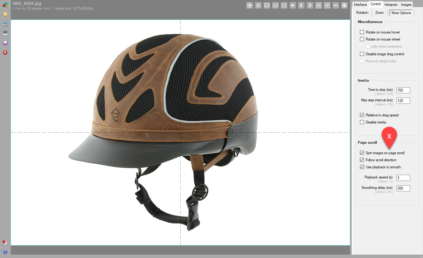
There are few options for advanced control:
- Follow scroll direction: animate images according to the direction of page scrolling (up/down to clockwise/counterclockwise).
- Use playback to smooth: if not checked, the speed of the image animation is relative to the amount of page scrolling. If checked, we activate the standard playback function on page scroll and you can then configure the speed of the playback and its responsiveness (to the release of the page scroll) in the same section.
The later creates smoother animation regardless of how fast user scrolls the page.

There's also a new template under Templates on the Publish form called Spin on page scroll that you may use to test this feature before delivering for integration.
5. Configurable drag acceleration
Here's an extra tool for your animation control toolbox. It's designed for 360 product spins that consist of an unusually high number of 360 product images.
Usually, we recommend to stay somewhere between 20 to 72 images per rotation but on occasion our customers may produce spins that consist of a couple of hundred or so images. The large number of images creates a very smooth animation at the expense of slower loading but often is a necessity. For example, we see in architectural 3D renderings such as this one that unless you render almost 200 images, the moving background may result in some disorienting and almost dizzying effect. Or you can think of photographing a car on a parking lot in 360 degrees which also may benefit from the higher number of images (also due to the moving background and usually somewhat jerky 360 footage you get on a parking lot or via a drone).
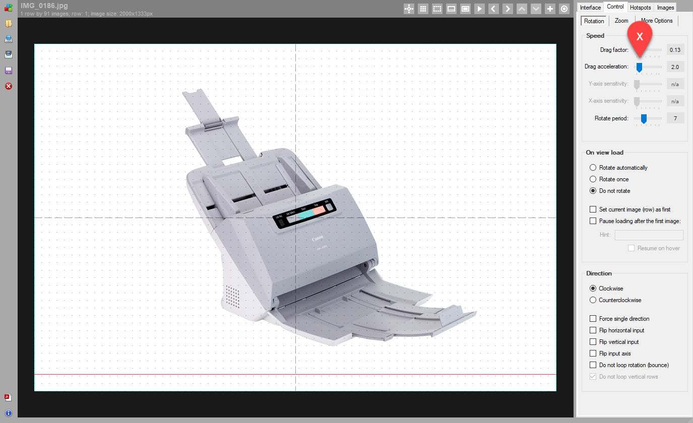
This brings us to the issue where the large number of 360-degree images makes it harder to spin the view. In other words no matter how fast you drag it, it takes too long to go through the entire spin (because there're so many images!).
And this is where the new Drag Acceleration feature is very helpful. The default is 1 which means no acceleration, and you can then activate the acceleration by dragging the slider and selecting desired acceleration multiplier which will speed up the image animation based on how fast user drags their mouse or finger.
6. Responsive hotspot indicators
At last you can make hotspot indicators responsive so that they scale with your views and look sharp and neat on small screen devices. To activate responsive indicators, access indicator styles as per the following screenshot and set Min scale (%) to some number that works for your view and/or custom hotspot indicator.
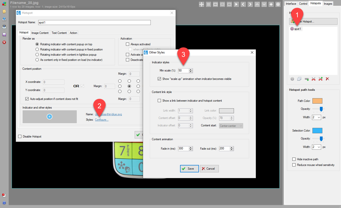
For example, if you set it to 50% and your indicators are 32 by 32 px, they will scale with the view (i.e proportional to the change of the base viewer width that you configure on the Interface tab in SpotEditor), and no matter how small your 360 product view ends up on a mobile device, they will be at least 16 by 16 px.
By the way, one of the improvements in the latest v3.6.5 is better precision of hotspot indicator placement inside a 360 view (we transitioned to floating point numbers for the calculations of hotspot path) which also helps with the smooth scaling.
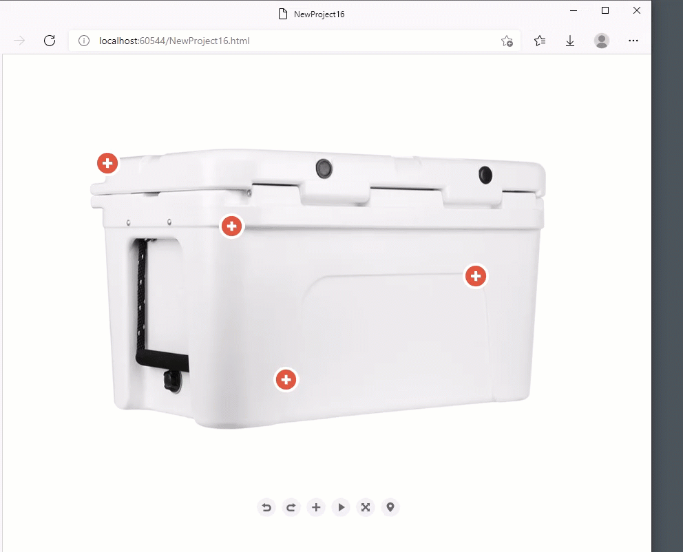
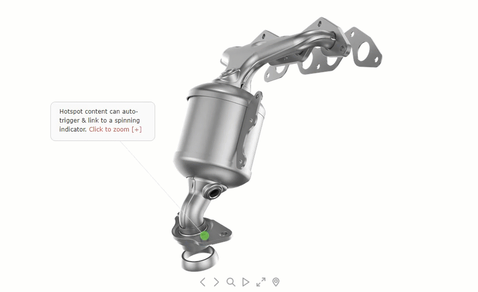
7. Always active & linked hotspot content
v3.6.5 introduces extra activation option called Always activated (see this recent example). Checking this option as shown in #2 in the screenshot below ensures that hotspot content, be it an image or text or custom styled html, is visible right away and no extra input is needed from user to "trigger" the hotspot.
Also unless when indicator is visible is also checked under Activation options, the content stays always visible, even when the hotspot indicator is not present on a given image. This can be useful in combination with the new content linking feature where a connecting line is added between the hotspot content and the indicator.
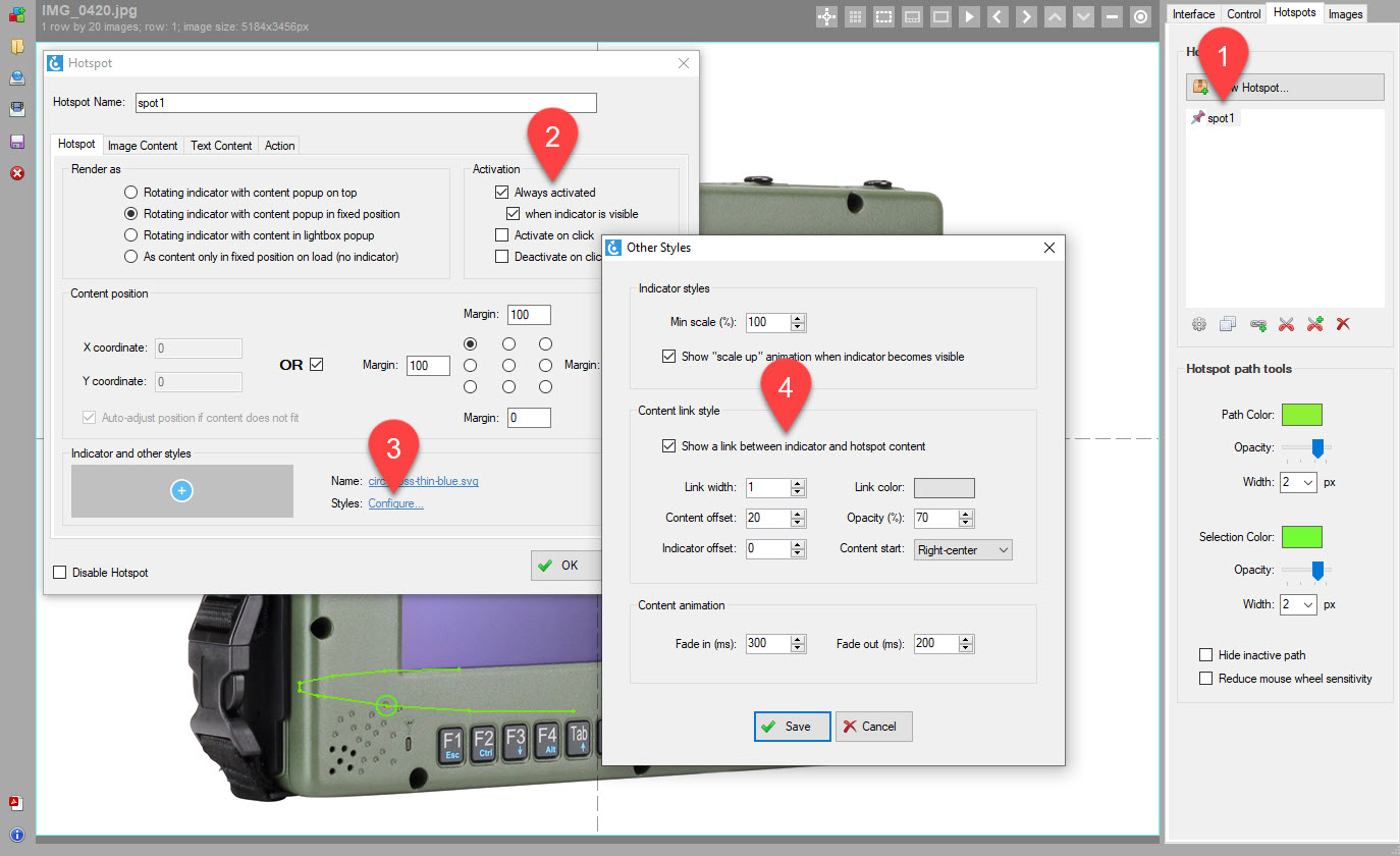
For example, user can select Rotating indicator with content popup in fixed position under Render as section of the Hotspot tab and position the hotspot content on the right side of the view at the top using Content position controls as shown in the screenshot. Then assuming a content link is also enabled as discussed below, when the hotspot indicator comes to view, a link between the fixed content and the indicator is shown and it links the two accordingly until the indicator disappears after following its configured trajectory.
To enable content linking, click Styles -> Configure on the Hotspot tab of the Hotspot form and then check Show a link between indicator and hotspot content under Content link style as per #4 in the screenshot:
- Link width: pixel width of the link (default is 1px).
- Content offset: offset from the content start position where to start the line.
- Indicator offset: offset from the indicator center where to end the line.
- Link color: hex color of the link (default is #eeeeee).
- Opacity (%): opacity of the link (default is 80).
- Content start: nine X-Y origins of the link relative to the content center.
Download or upgrade
There are more features, important fixes and enhancements in this release (e.g configurable resolution of imported images, new "zoom to hotspot" action, configurable "play to label" action, new API additions, etc).
To get this update in your existing SpotEditor installation, click blue "info" icon in the left toolbar in SpotEditor and select Check Updates.
Free version can be downloaded under "additional resources" using this button: