Today we’re releasing our last v3.6 beta build before the final release. It’s packed with new features, enhancements and bug fixes.
As you can see in our product timeline, this new beta release took some time… This is because with this release we wanted to address some of the shortcomings that cropped up in the last two years which required an overhaul of a significant chunk of functionality. The main area of improvement in this release is a better mobile support, drastically improved hotspot presentation & handling and more control over multi-row 3D product viewing.
LIGHTBOX HOTSPOT
We're really excited about this new hotspot mode. It makes it possible to showcase your hotspots with images and text at the same time in a consistent and flexible manner. Even more importantly, this new mode is our most mobile friendly yet as it takes the entire space of your 3D product viewer and gives enough real estate to deliver your hotspot message "responsively" on any screen size. We also went to great length to give you a lot of control over the lightbox presentation!
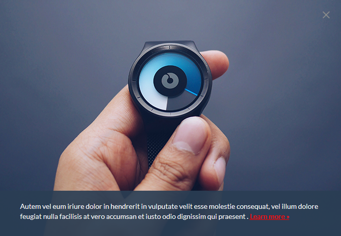
To start with this new hotspot mode, first select "Rotating indicator with content in lightbox" on the main Hotspot tab under "Render as". Then add your image and text on the Image Content and Text Content tabs and fine-tune your presentation further with a set of new settings that you will see on these tabs.
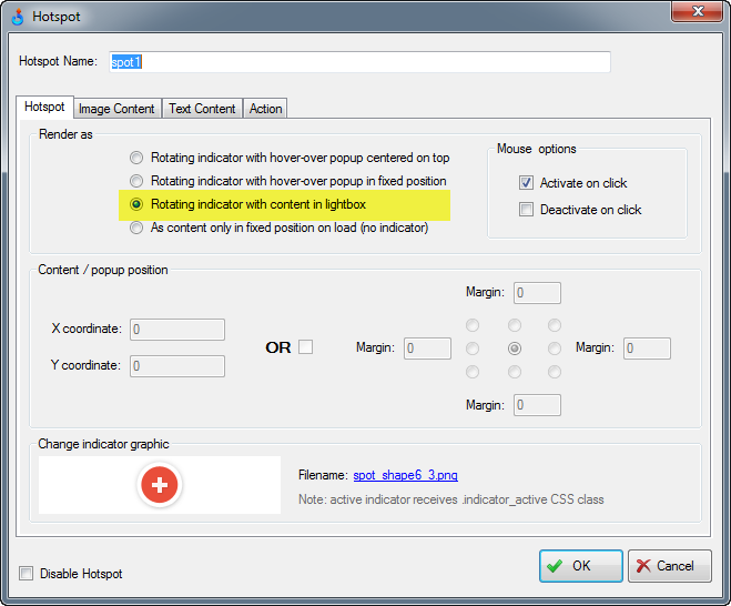
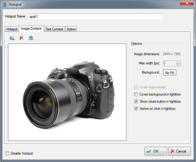
On the Image Content tab (as shown below) the following options are applicable to lightbox:
Background
Select your lightbox background color.
Cover background in lightbox
This means that your lightbox image is not just squeezed to fit proportionally into the lightobox, but rather it makes sure that the image covers the entire lightbox space without any see-through gaps. This may result in some parts of the image not being visible (depends on the image proportions relative to viewer size) but may give you a much nicer presentation when you need to zoom in on a certain product feature or simply need to entirely cover the lightbox space.
Show close button in lightbox
If selected, we will show a small "close" button in the right corner of the lightbox popup. We made it such that the icon is visible on both dark and light backgrounds but if you decide to customize it for your 360 product views, the image name is lightbox_close.svg and it's located in the published skin folder and is the same for all skins.
Active on click in lightbox
This controls whether lightbox should respond to clicks or taps outside of the close button. If it's checked and there's no action assigned on the Action tab, a click or tap inside the lightbox will simply close the lightbox. If action is assigned, it will be launched accordingly.
If it's not checked, nothing happens on click or tap unless user hits the close button. A notable exception to this rule is when you have an embedded URL link in your lightbox text that you enter on the Text Content tab that we discuss further in this post. So when there's an empty URL (not linked to any website) inside the text content, a click on tap on the hyperlink will trigger a hotspot action if it’s assigned on the Action tab. Otherwise, such hyperlink will just navigate to your linked website.
Text Content tab has been completely reworked in this release. Please see more details about the changes and how they apply to the new lightbox hotspot in the following section.
TEXT CONTENT STYLING
Finally, you can really style text inside your hotspots popups (and now lightboxes as well!). As you can see in the following screenshot, the possibilities are pretty much endless with custom fonts, text align, line height, padding, opacity, border control, colors and more.
Also, now you can have all the handy styling as well as HTML markup such as URL hyperlinks without switching to custom styling mode. But if you really need a completely custom styling for your hotspot text, just select "Use custom styles" and none of the style settings will apply (this replaces HTML mark mode we had in previous releases), and you can then use your own CSS to style the text content as needed via .hotspot_cdata CSS class that is assigned to such “unstyled” hotspot element.
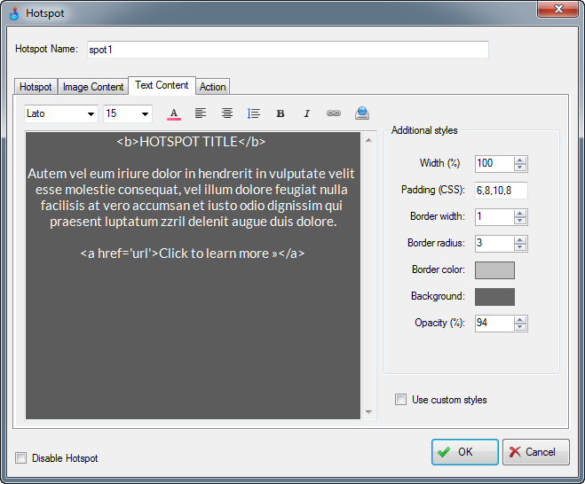
Note that when text content belongs to a lightbox hotspot as discussed in the previous section, the Width field is measured in % and in most applications would need to be set to 100%. Most likely you would also want to set your border width to 0 as well in that case as it should look nicer without text borders inside the lightbox.
PS: if you wonder how to configure the new Padding field, it follows standard CSS padding numbering where the padding value of 15,20 means that the top and bottom padding is 15px while the left and right padding is 20px. The padding value of 15,20,30,40 means that the top padding is 15px, right is 20px, bottom is 30px and the left padding is 40px.
HOTSPOT ACTIVATION
There're two major hotspots enhancements in this build for hotspot activation and deactivation. First, a click or tap on a hotspot indicator will now trigger a hotspot action if assigned even when there's no image or text content (i.e no popup or lightbox). Previously, you could only trigger the hotspot actions inside a popup which was quite limiting. This small feature required a complete overhaul of the hotspot handling as clicking and taping is handled quite differently on touch-screen devices and the hybrid ones that can have both mouse and touch input.
The second enhancement is a new hotspot deactivation mode (Deactivate on click) which you can now select on the first tab of the hotspot form to make sure the hotspot popups close only when user clicks again on activated hotspot indicator or when the click is outside of the hotspot popup. In our previous released, the popups would close immediately when user's mouse would leave a hotspot popup or the indicator icon.
HOTSPOT JAVASCRIPT ACTION
There's a new hotspot action that can trigger your custom JavaScript function on tap or click on the hotspot indicator or inside a popup or lightbox. Simply select JavaScript action on the Action tab and then enter the name of your JavaScript function. The function receives a single parameter which is an object containing all configuration settings of a hotspot that triggered this action. Please note that the same can be achieved using our new advanced hotspot APIs as discussed in the following section.
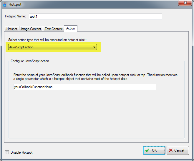
Example:
<script type="text/javascript">
function yourCallbackFunctionName(hotspotConfig) {
    // Handle your custom action here
}
</script>
HOTSPOT APIs
With the release of APIs in v3.5 about a year ago and some recent API additions for multi-row 3D product views, you could already control most of the viewer functions. Hotspots for the large part were still inaccessible until this release.
Now you can pretty much take over the hotspots in every possible way. Let’s briefly review the new API functions and you can then simply publish your 360 or 3D product view in SpotEditor using the JavaScript template (which was also updated) to see these APIs in action:
api.hotspots.activate(hotspotName, optionalTimeout);
Activates content of a hotspot identified as hotspotName (the one you enter on the Hotspot form in SpotEditor). In most cases, this will automatically open associated hotspot popup that will be kept opened for the number of milliseconds that can be optionally passed via optionalTimeout.
api.hotspots.deactivate(hotspotName, optionalTimeout);
Closes a hotspot popup that was previously activated (opened) via the API or manually.
api.hotspots.onActivate(function(hotspotData){ return false; });
This callback is executed when user or API triggers the opening of a content popup or lightbox. hotspotData contains a lot of info about the hotspot including its xml configuration, allowing you to override the hotspot content on its first activation. Return true to prevent default hotspot popup rendering or false, to let the viewer render the popup.
api.hotspots.onDeactivate(function(hotspotData){ return false; });
This callback is executed when user or API deactivates hotspot content, i.e. when a hotspot popup or lightbox is being closed. Return true to prevent default deactivation logic.
api.hotspots.onAction(function(hotspotConfig){ return false; });
This callback is executed when user triggers a hotspot action that can be assigned under the Action tab in SpotEditor. Note that unlike the previous two API callbacks, this function only receives the hotspotConfig parameter which doesn’t include supporting data such as current hotspot indicator coordinates, visibility, or a reference to a parent (viewer) container. Return true to override default action handling.
api.hotspots.getDynamicHotspots();
Returns an array of all hotspotData objects (for dynamic hotspots only, i.e. the ones that have a moving indicator), allowing you to customize them on the fly (if done before the first popup activation), checking indicator visibility, etc.
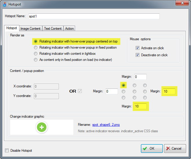
HOTSPOT POPUP POSITIONING
MOBILE VIEWING
Besides our new mobile friendly lightbox hotspot, there’re several other interesting enhancements in this release that can improve your 3D product spins on modern mobile devices.
Use SVG images in hotspots
Previously you could only use raster images (JPG, PNG, ets.) for your hotspot indicators or hotspot content images (popup images). Now you can also select SVG images for both such that they look sharp at any screen density.
Responsive hotspot content images
There’s a new setting under Image Content tab of the hotspot form called Scale Responsively. As the name implies, the images will resize automatically with the viewer if it’s part of a responsive website layout when this setting is selected. This was not fully supported in our older releases.
Control max image width in hotspot content images
Since now you can configure the hotspot content images to scale responsively, this setting can help ensuring that the images do not go beyond a certain width such that they look sharp at any resolution or screen density.
responsiveMinHeight
This new viewer setting can be used to set minimum height of the viewer when it’s part of a responsive layout. This can be helpful on small mobile screens where you may not want the viewer height to go beyond a certain fixed minimum. To see how it’s configured, publish your 360 or 3D product view using Responsive template that can be selected on the Publish form. Then change the value of responsiveMinHeight that you will see in the published html file from 0 to some meaningful minimum.
Double Tap Zoom and Full-screen
Zooming on double-tap on mobile devices was disabled in one of our old 3.x releases. We just couldn’t achieve sufficient consistency across various smart phones at that time. Now it’s all resolved and works great! We also added a new “double tap” option in SpotEditor to make the product viewer switch into the full-screen mode instead. These settings are located under Control->More Options tab.
3D PRODUCT VIEWING (MULTI-ROW)
Several improvements were introduced in this build to help with multi-row product views, where images can be rotated both horizontally (our standard 360 product viewing) and vertically.strong>Full multi-row loopThere’s a new option in SpotEditor called “Do not loop vertical rows”. It controls whether to loop through the rows when you drag images vertically or to bounce at the first or last row if your 3D image renderings or 3D product photography doesn't have a full set of rows to cover all angles in a vertical spin (usual scenario). We were bouncing rows by default in the previous releases and until now there was no way to change this behavior.
Unlimited number of rows
New Project form now allows importing a configurable number of rows. Previously we were limiting it to 20 which (as we quickly found out!) was not sufficient for some advanced uses our clients had in mind.
Y-axis / X-axis sensitivity preview inside SpotEditor
Previous v3.6 beta introduced two new parameters in SpotEditor, Y/X-axis sensitivity, allowing you to make 3D object spinning more predictable as you can better control when it’s ok to spin rows vs flipping image frames (within a row). With this release, an immediate preview of the effect of this setting is available inside SpotEditor.
Toolbar and keyboard shortcuts
Flipping rows in SpotEditor was made simple: use updated toolbar controls with the up & down arrow buttons or navigate your 3D product view simply by pressing up, down, left and right keys on your keyboard (the keyboard shortcuts are not limited to just the Hotspot tab anymore!).
MISCELLANEOUS
- Full monitor “full-screen” now works in IE11 and Edge browsers (other major browsers have been supported since the feature was introduced in v3.0).
- There’s a new button on the Hotspots tab next to the gear (hotspot settings) icon, which creates a duplicate copy of any currently selected hotspot. This can be a real time-saver.
- Control tab has been divided into two sub-sections: Rotation and More Options.
- There’s a new setting called “Flip horizontal input” in SpotEditor under Control->Rotation tab. It makes images spin in an opposite direction to mouse or touchscreen drag. Note that we have existing settings for rotation direction control (Clockwise and Counterclockwise), but these settings also affect the automatic playback direction and this doesn’t always work when the images are produced with a certain playback sequence in mind. So this new setting addresses such special cases.
Previously released features and fixes in v3.6:
- WebRotate 360 Product Viewer 3.6 Build 604
- WebRotate 360 Product Viewer 3.6 Build 542
- WebRotate 360 Product Viewer 3.6 Build 127
- Full version history
PRO & Enterprise customers can either request the commercial version of v3.6 Beta via support email (support at webrotate360 dot com). If you received v3.6 beta download URL from us before, it still works! And if you already have the previous build of v3.6 beta installed, you can simply download the new update via Check Updates on the About form in SpotEditor.
If you need any help applying this update to any of WebRotate 360's plugins (i.e, WordPress, Joomla, PrestaShop, Magento, OpenCart, BigCommerce), please let us know and we would be happy to assist.